
.jpg?width=2481&name=2%20(2).jpg)
Linwood Swimming Pool features possibly the most vibrant use of colour of any recent project. It's playful, energetic and utterly captivating. Adding real character to the building, the aesthetic perfectly matches the purpose and the energy contained (and expended) within.
There are other wonderful examples from around the world which use colour in innovative and captivating ways. Such as the Brandhorst Museum in Germany, which its 36,000 coloured rods set against perforated aluminium to create a dynamic facade that seemingly moves as the sun changes position.
Portobello Road in London is famously colourful, helping make it one of the most visited addresses in a City not short on attention grabbing architecture. Then there are those examples which use a single colour to such dramatic effect, like the Porta Fira Towers in Barcelona. The red aluminium tubes used are all independent, the ends attached to ball-and-socket joints for the desired torsion. The effect is utterly beguiling.
What Different Colours Mean
One of the things we know about colour is 'we know what we like.' But we don't necessarily know why. It appears there's quite a bit of psychology behind it all though. Yes - that urge to grab a burger from McDonald's is clearly not our fault. We've been conned by their clever colour play It seems colour has the power to stimulate, seduce and connect with us emotionally. For McDonalds, it connects with our hunger. Here's a quick look at the psychology behind some of the main colours:
Red
A colour all about urgency, passion and a quickening of the pulse. It grabs your attention and doesn't let go too easily. Which is why red is the default colour for many warning signs. It's also very overpowering, so too much of it can be... well, too much. That said, those Porta Fira Towers are simply breath taking and the colour works precisely because it is so dominant.
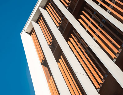
Orange
It's all about warmth and happiness. Orange is very much the nice compromise, blending the energy of red with the cheerfulness of yellow. It's an energetic colour but not overwhelmingly so. However, in recent times orange has become somewhat synonymous with budget brands (think Jetstar) and even Go Orange down in Milford (which was launched as a budget conscious offering by Real NZ).
Yellow
Otherwise known as the happy colour, yellow gets us excited and makes us happy. Which is why it's often found in Early Childhood Education Centres. It makes a great accent colour and is sometimes considered as 'the creative colour for new beginnings.' Maybe because yellow is the colour of spring and a fresh start? Interestingly, fast food outlets often use yellow to act as a counter to red; they get your attention (red) and then welcome you in (yellow).
Green
Welcome to nature and a world of harmonious balance. Green is all about relaxation, being the most restful colour on the eye. Invariably connected with the environment and sustainability, green is generally a positive colour although overuse is linked to feelings of greed and jealousy. On the other hand, wearing a green tie to the meeting with your Bank Manager will, we're told, help you get what you want. Interestingly, many Accountancy and Financial Firms have green logos so there must be some connection.
Blue
It really is the antithesis of red. Blue is calming and reassuring. It's cool, soothing and dignified. Which must be why blue is part of the Insol brand colour scheme then. Yes, it seems our colour choice signifies loyalty and integrity. Some say it inspires wisdom... and who are we to argue. On the flip side, apparently blue can be boring (we disagree of course).
Purple
Like blue, we're told purple will make you feel all relaxed and at ease. It's a colour for the sensitive soul, those with imagination and a quiet dignity. Although we're pretty sure the Joker from Batman was draped in purple but we guess there's always an exception.
Cultural Considerations For Colour Choice
Covid might have put a damper on travel and migration for a while but it'll bounce back. So given we're now essentially a global village, one of the complicating factors when it comes to colour will be cultural sensitivities. For the most part, it would seem there is a general (although not complete) consensus on colours. The Western World, more often than not, aligns with Eastern and Asian cultures, along with Latin American cultures.
At the very least, whilst interpretations and reactions to different colours may vary, it's unlikely choosing red for a face will offend anyone. This is likely to do with context as much as anything else. For example, red might tend to evoke feelings of danger and is associated with evil in the Middle East, yet McDonalds maintains their red brand colour for their restaurants there.
That said, some colours might be best avoided. Tourism operators in New Zealand were known to avoid using too much white if a large part of their business came from Chinese clients. The reason being white is seen as the colour of death, representing sterility, unhappiness, mourning and misfortune.
Colour Options
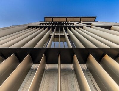
One of the advantages of aluminium is the ability to apply a powder coat of almost any shade of colour desired. Whether it's to make an impact statement with a bold colour or to add a final flourish to a design with subtle tones, a range of curated options are available.
Then there are the graphical options. A powder coat can make the aluminium look anodised. Or it might be used to create a pearlescent or metallic finish. There are even 'surreal effect' options which might be used to create the impression of graphite or stone.
Finally, there's the wood grain powdercoat. It's an incredibly realistic reproduction of a natural wood grain which is 'printed' into the aluminium. Both Selwyn Health Hub and Country Club Huapai use a wood grain powdercoat to create a character that is enduring, benefitting from the longevity and relative maintenance free nature of aluminium, with the warming appeal of wood.
Colour Limitations & Technical Considerations
There are some limitations to colours that cannot be avoided. Everything from sunlight to bird poop can degrade a colour's vibrancy over time. Some more so than others.
Red and blue are both particularly susceptible to fading. doing so more quickly than other colours. The main culprit here is Mother Nature. Ultraviolet rays carried by sunlight do damage to most everything, including kevlar. So if UV rays can degrade bullet-proofing then they can certainly degrade a colour powder coat.
Colours come from a region of molecular structure known as chromophores, which absorb photons of visible light a specific wavelengths. The photons which aren't absorbed are re-emitted and the wavelength of these photons determines the colour we see. A higher energy photon (such as those found in UV rays) damages the structure of chromophores over time, affecting their ability to emit photons (or show colour). Red is great at absorbing higher energy photons but it does so at a cost to its chromophores, which get damaged more rapidly than other colours, leading to quicker fading. This is why red vehicles look quite stunning when new, but have a habit of fading badly as time passes. The real kicker is that splendid red is still there and hasn't gone anywhere. It's just the red-emitting photons are weaker and doing a poor job. Blue suffers from the same fate.
Atmospheric conditions play their part too. In coastal areas, the combination of salt and atmospheric moisture is known to deteriorate coatings faster. Move away from the coast to inner city industrial areas and airborne contaminants mix with the rain to do damage. Then there are birds. No mater where we build there are birds, whose bodies produce uric acid to digest food. This then gets pooped out and ends up on the powder coated aluminium and eats away at the surface.
Anodised aluminium is less susceptible to fading as the colour is embedded deep into the pores of the aluminium. It reflects, refracts and absorbs light with much less damage to the chromophores. Indeed, coloured anodised aluminium is virtually impervious to degradation from UV rays. But the colouring process comes with its own limitations. Achieving a consistency of colour can be challenging as the aluminium itself may have different markings (no two batches of aluminium are identical). Yet the real issue is the availability of colours. The process for adding colour to anodised aluminium is more technical than a simple powdercoat and some colours simply do not take well. Blue-grey colours are more prevalent, along with the metallic shades such as bronze. Yellows and red are harder to produce consistently.
Yet whilst there are some considerations when choosing a colour, the fact remains there is much to choose from. For the most part, the canvas is blank and ready to accept whatever colours you wish to apply. That's a pretty exciting starting point.